01 · The Client
CRAFT BEER · ST. PETERSBURG, FLORIDA
GREEN BENCH BREWING CO.
An ongoing series of illustrated beer labels created for an independent St. Petersburg brewery, translating the story and personality of each release into something worth picking up off the shelf.


02 · Project Overview
A DIFFERENT STORY WITH EVERY POUR.
Green Bench Brewing Co. has an established brand and a constantly evolving lineup of specialty seasonal beers, each with its own name, inspiration, and personality. Saltbox works within that existing world to develop original label concepts and illustrations for individual releases.
The challenge is different every time: take the idea behind a beer and turn it into a visual story that feels distinctive on its own while still sitting comfortably within the larger Green Bench family.
Client
Green Bench Brewing Company
Industry
Craft Beer · Brewery · Hospitality
Location
St. Petersburg, Florida
Services
Beer Label Design · Tap Handle & Sales Sheet Design · Illustration · Production-Ready Artwork
03 · The Challenge
GIVING EVERY SPECIAL RELEASE BEER AN IDENTITY OF ITS OWN.
With each release comes a new story to tell. The label needs to capture the personality behind the beer, stand apart from previous releases, and create something customers want to pick up and explore. At the same time, every design needs to function within Green Bench's established packaging system and translate successfully from illustration to a finished can.
Tell The Story
Turn the name, inspiration, and character of each beer into a visual concept rather than simply decorating the package.
Keep It Fresh
Approach every release as an opportunity to explore a different illustration style, composition, palette, or visual idea.
Make It Work On The Shelf
Design artwork that holds up at can size, communicates clearly, and gives each release a strong presence alongside an ever-changing craft beer lineup.
04 · Creative Process
FROM A BEER NAME TO A WORLD OF ITS OWN.
Each label begins with the story behind the beer. From there, concepts are developed through research, sketching, illustration, typography, and color before being translated into Green Bench's established label format.
Because no two releases tell the same story, the process leaves room for experimentation. The result is a collection of labels that can look very different from one another while sharing the same attention to concept, detail, and craft.
05 · Label Design
A FRESH CANVAS WITH EVERY SEASONAL RELEASE
Working within an established brewery brand creates an interesting balance: the packaging needs to feel like Green Bench without every beer needing to look the same. Original illustration gives each release its own visual story, allowing the artwork to move between different subjects, moods, eras, and styles depending on the story behind the beer.
The consistency comes not from repeating the same aesthetic, but from approaching every label with the same emphasis on storytelling and thoughtful execution.

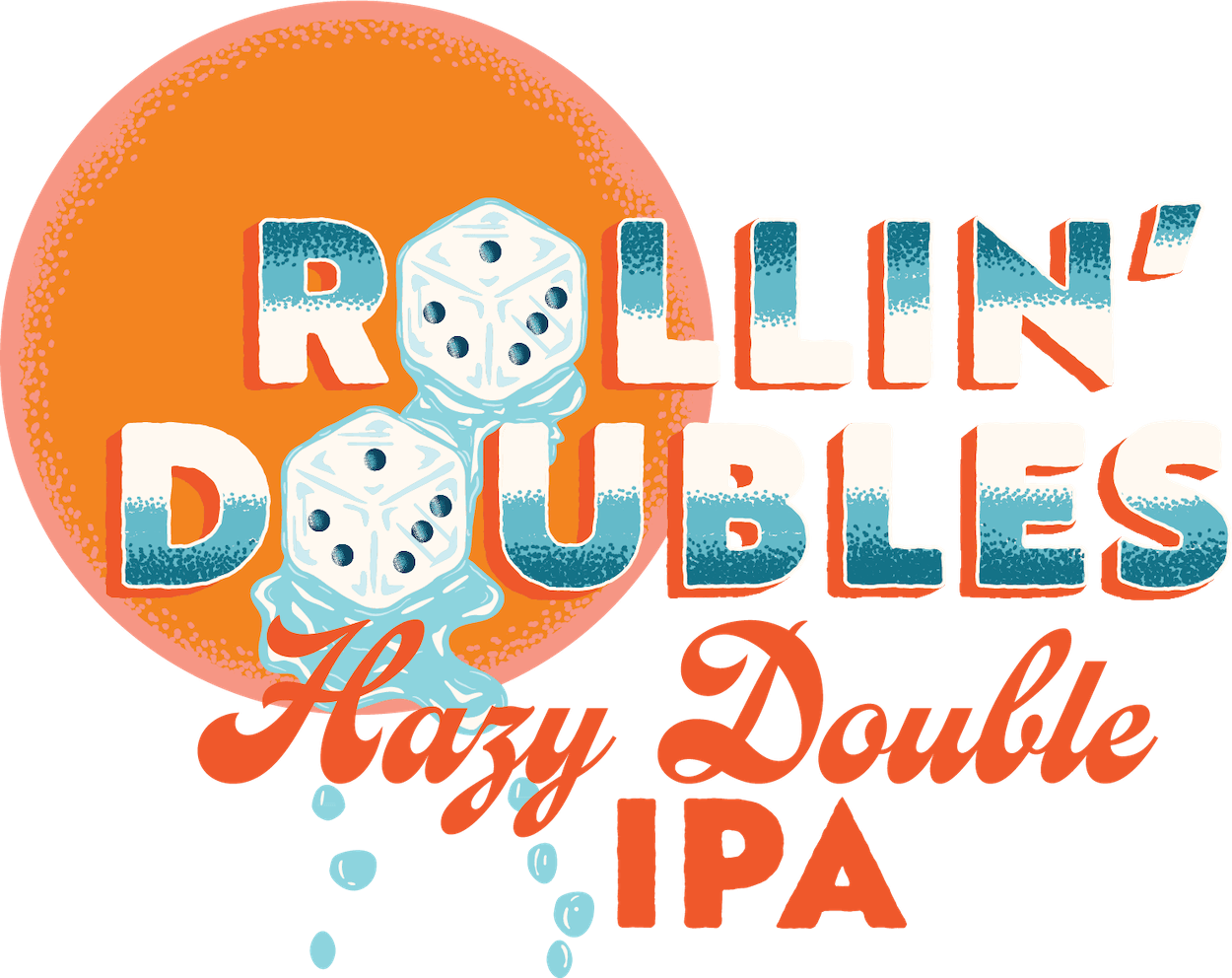
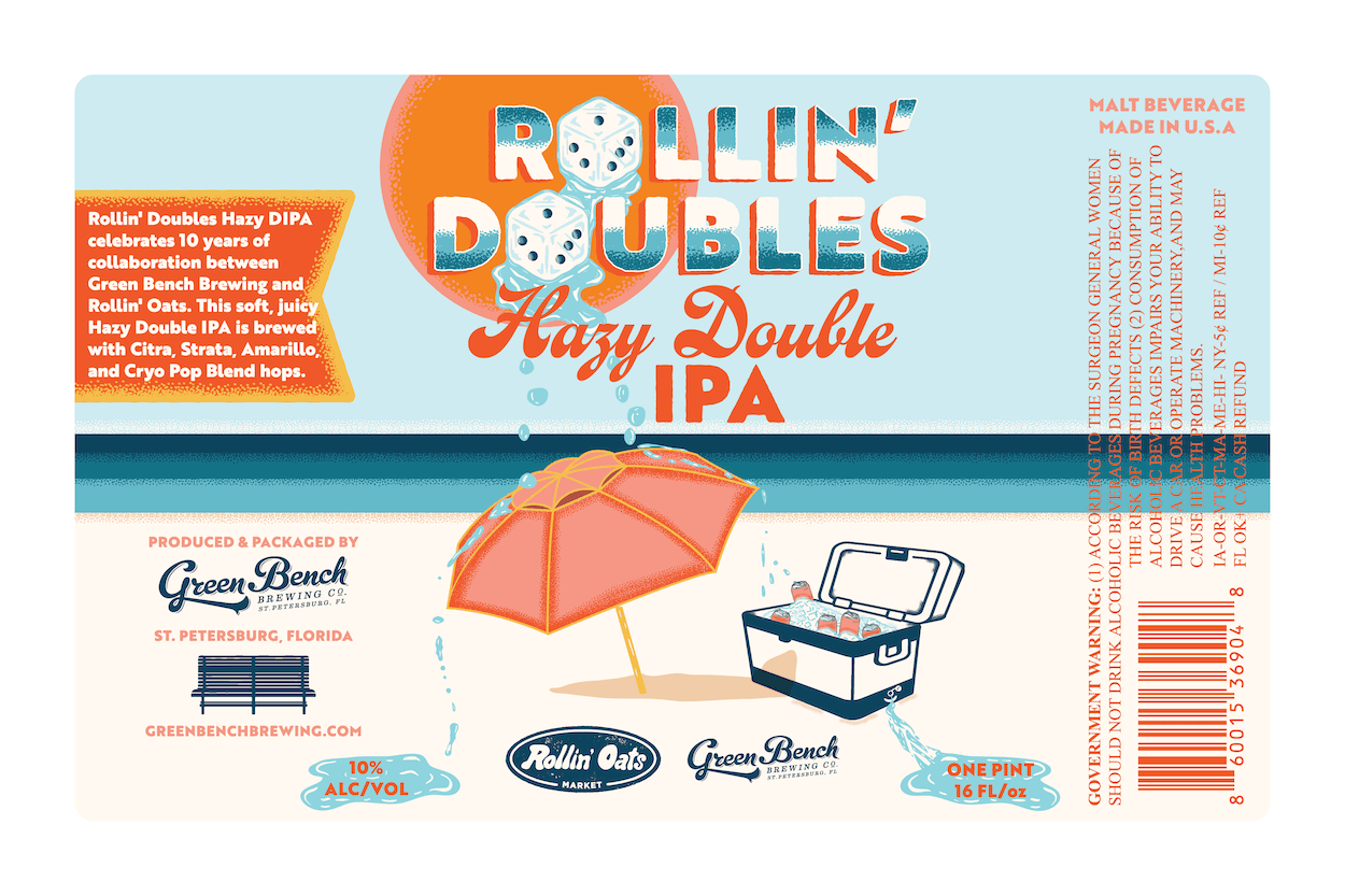
ROLLIN’ DOUBLES
A Hazy Double IPA
For this beer in collaboration with Rollin’ Oats, I was going for blazin' hot summer vibes. I drew a pair of melting ice dice dripping down into puddles on beach sand that is probably deadly to walk on barefoot. No clouds in the sky, sun blazin', and not a chance of rain in sight. There's no people on this beach either because its just too damn hot. The umbrella provides a pitiful looking respite and some stupid soul left the cooler lid open under the full sun.
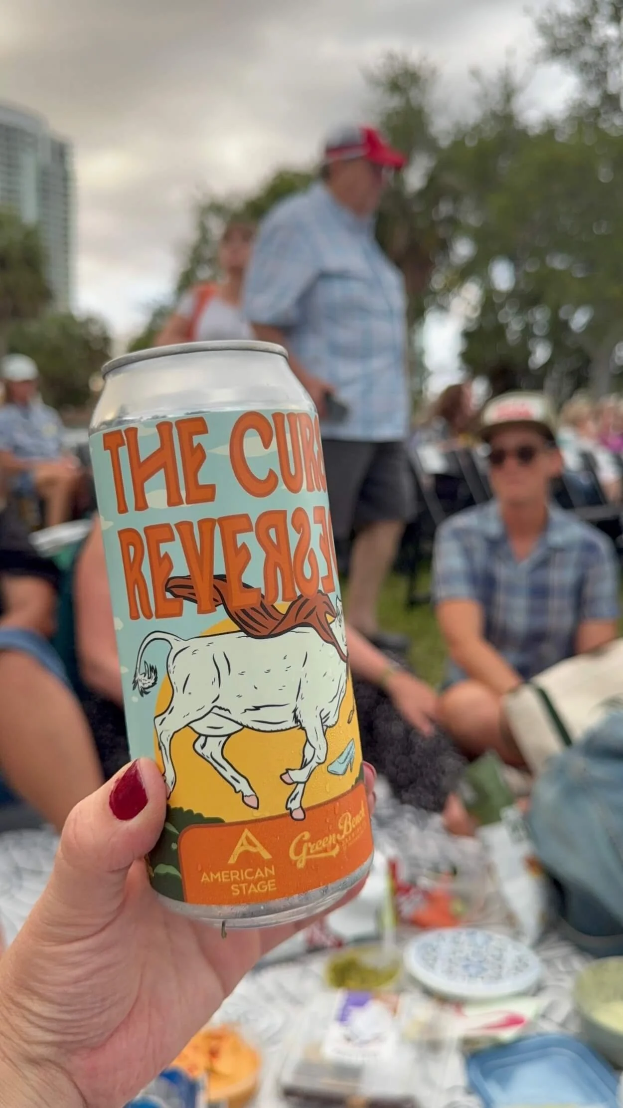
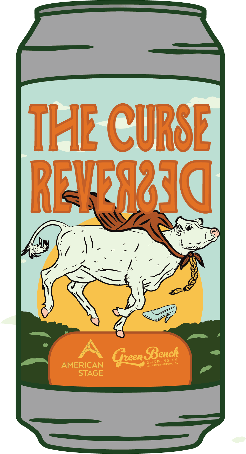
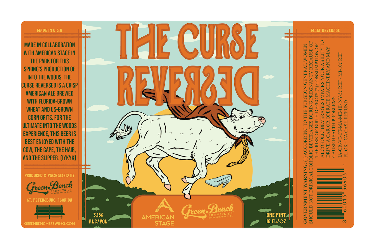
THE CURSED REVERSED
A Crisp American Ale
For this beer in collaboration with American Stage in the Park, I wanted the label design to be colorful and playful, incorporating cow, cape, hair, and slipper drawings from the Into the Woods play, making it perfect for a spring park performance.
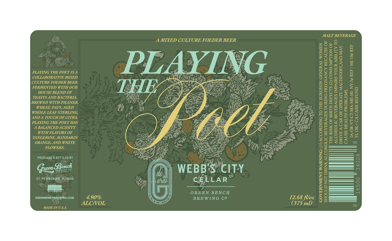
PLAYING THE POET
A Mixed Cultured Foeder Beer
For the Playing The Poet label, I used the ingredient and tasting notes as inspiration for this label design. I drew a bouquet of white flowers, hops, tangerine, and mandarin oranges. To me, Playing The Poet speaks to the act of taking elements from nature and turning them into something lovely, refreshing, and meant to be shared...much like a thoughtfully arranged bouquet. With a February release and spring just around the corner, this felt like a natural visual direction for the beer.
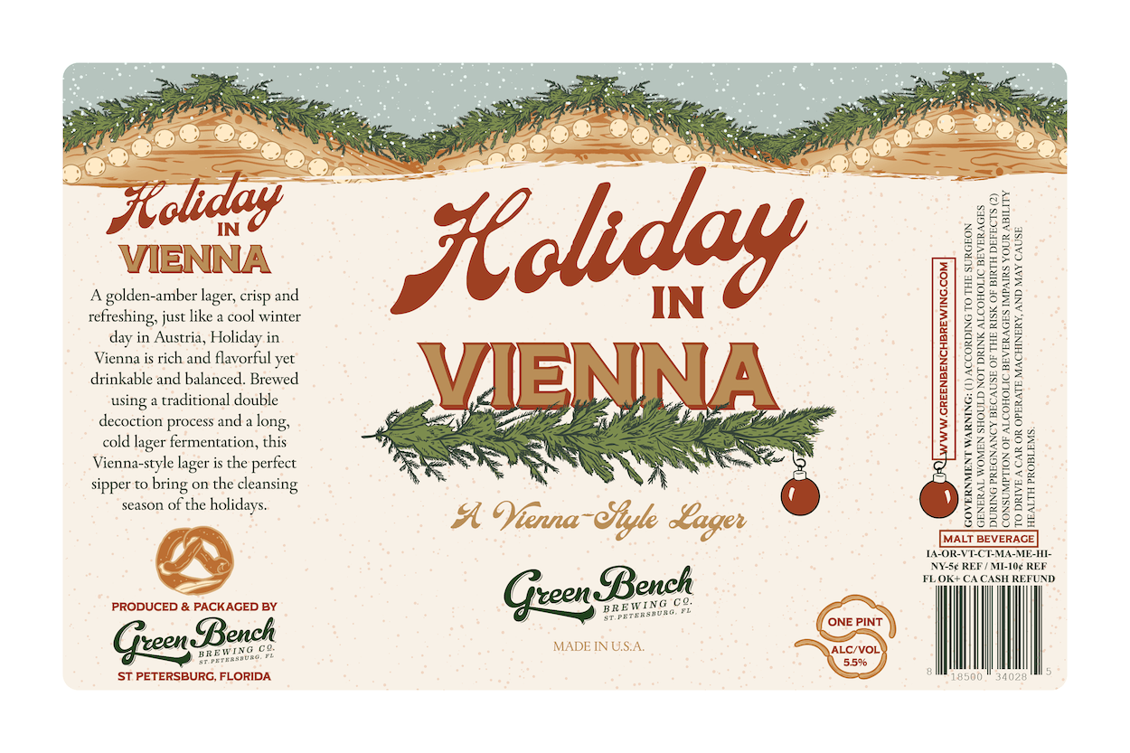
HOLIDAY IN VIENNA
A Vienna-Style Lager
The artwork for the Holiday in Vienna label touches on the holiday romance of Vienna Christkindlmarkt huts and old world charm spent bundled up eating a Bavarian pretzel under the soft glow of lights.
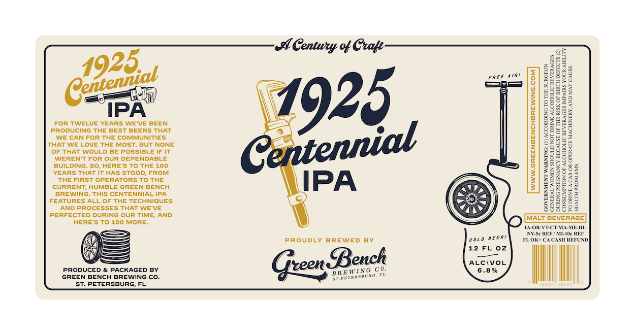
1925 CENTENNIAL IPA
A Century of Craft
Inspired by Green Bench’s building that celebrated its 100th year, the artwork for 1925 Centennial IPA draws from its humble beginnings as a tire shop. Cheers to 100 more years!