01 · The Client
HOSPITALITY · SAFETY HARBOR, FLORIDA
THE TIDES MARKET
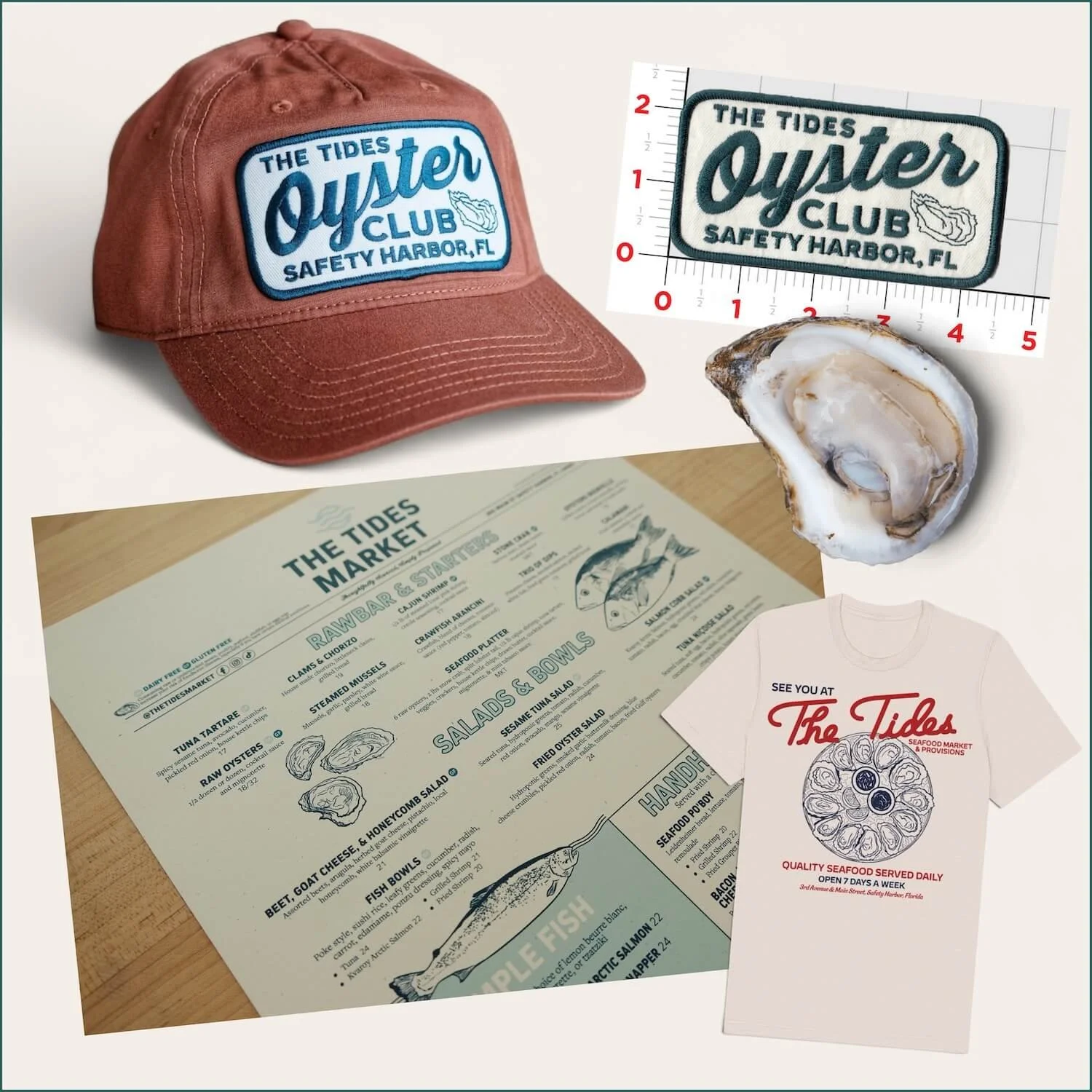
A complete brand system built across identity, menus, merchandise, packaging, and web for a neighborhood seafood market and restaurant everyone comes back to.

02 · Project Overview
A NEIGHBORHOOD MARKET AND RESTAURANT NEEDED ONE COHESIVE VISUAL LANGUAGE.
The Tides needed a brand that felt local, fresh, and elevated yet distinctly Gulf Coast without relying on generic nautical imagery. The system had to work across a wide range of customer touch points from logos, to restaurant menus, apparel and an e-commerce website.
Client
The Tides Market
Industry
Restaurant · Market · Hospitality
Location
Safety Harbor, Florida
Services
Brand identity, illustration, web design & SEO, menus, merchandise, packaging, packshot product photography, and production support
03 · The Challenge
THE BRAND HAD TO FEEL STAND-OUT IN THE TAMPA BAY SEAFOOD SCENE FROM DAY ONE.
Coastal, not cliché
Create an Old Florida sensibility without overusing anchors, palms or obvious beach graphics.
Flexible system
Build a visual language strong enough for menus, apparel, packaging, and web.
Retail-ready
Support both the dining experience and a merchandise-driven retail program.
04 · Visual Direction
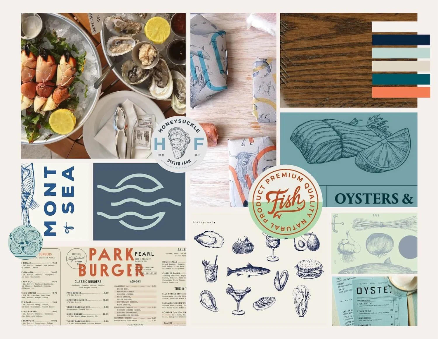
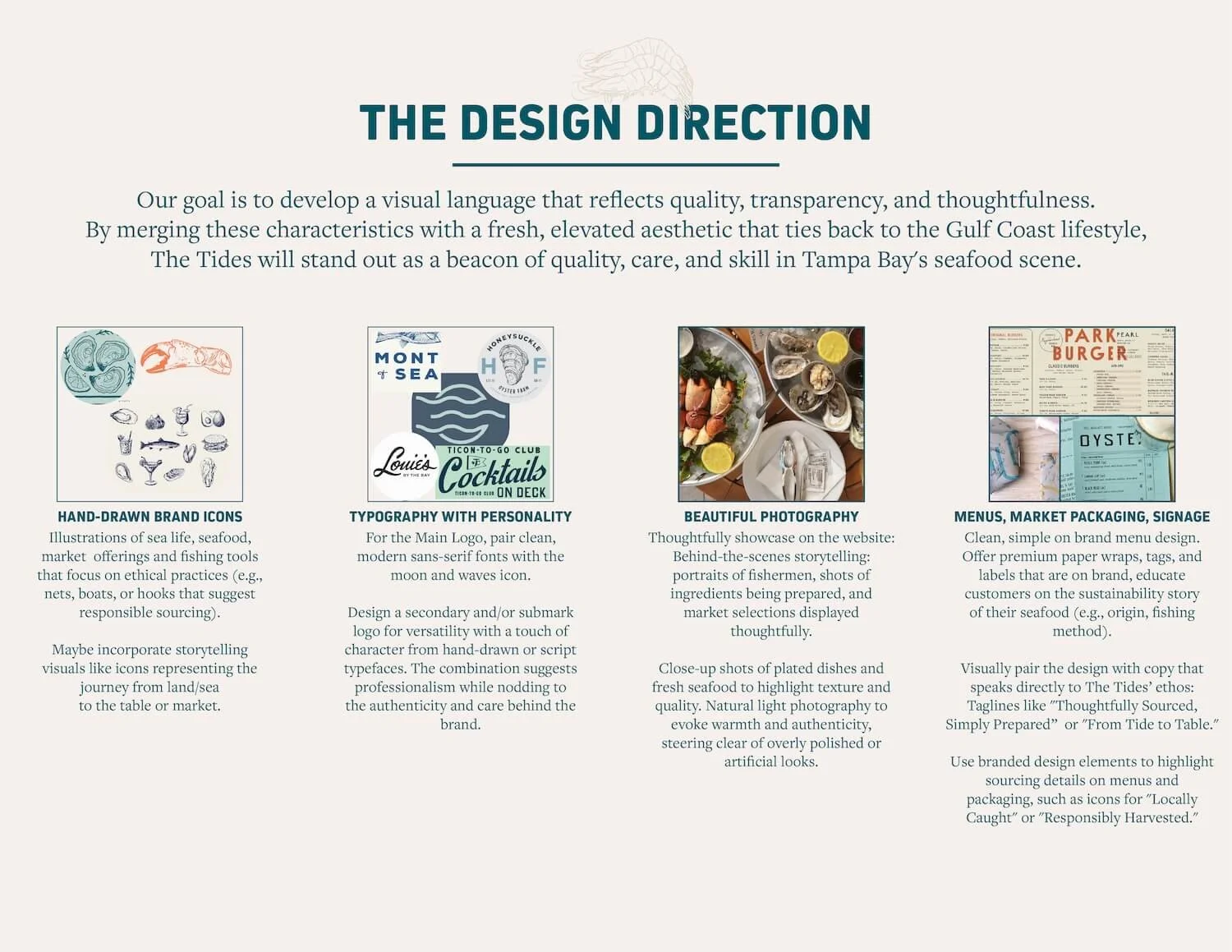
FROM BRAND REFERENCES TO A USABLE CREATIVE SYSTEM.
05 · Brand Identity
A VISUAL FOUNDATION DESIGNED TO SCALE.
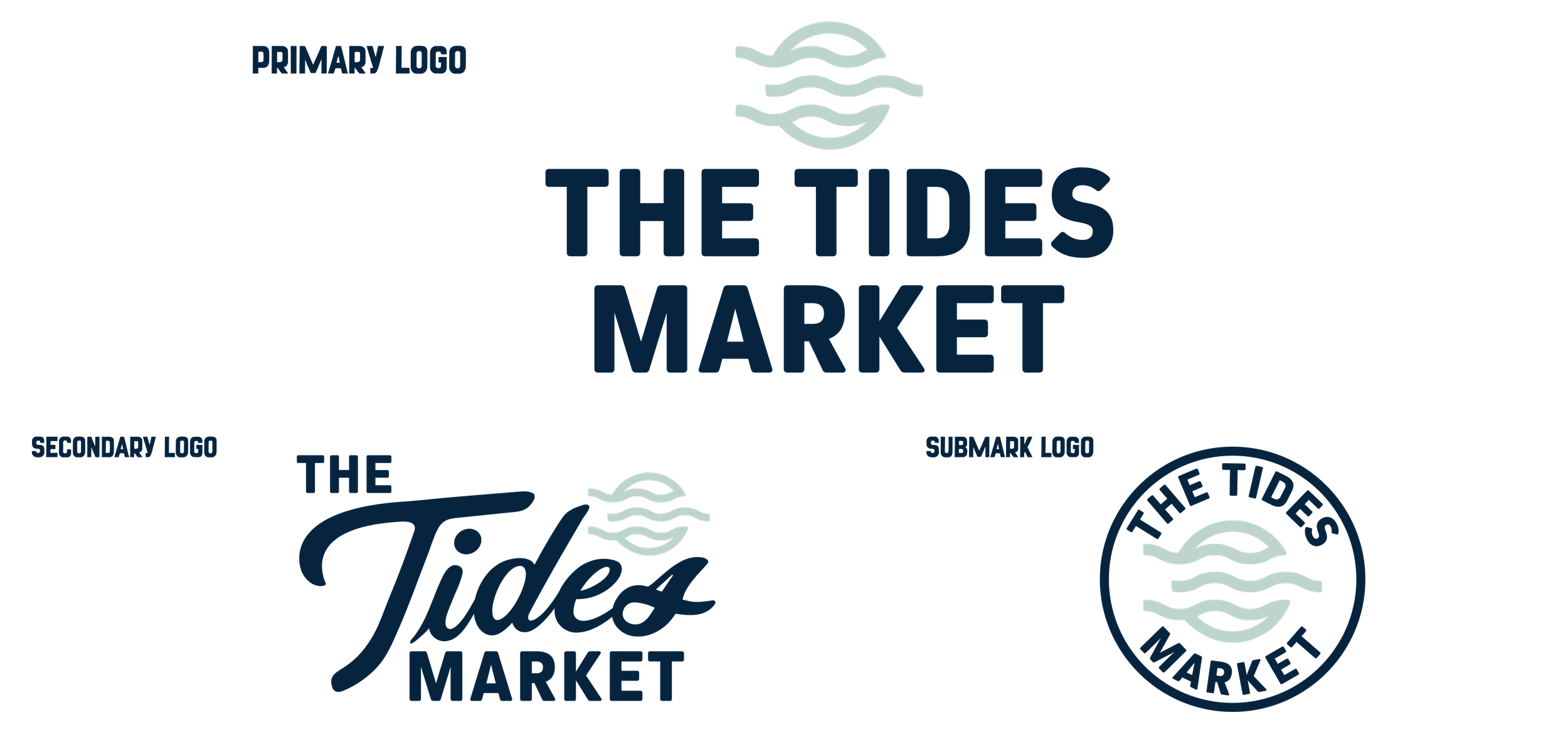
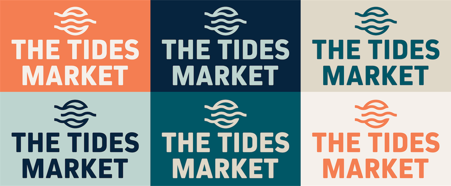

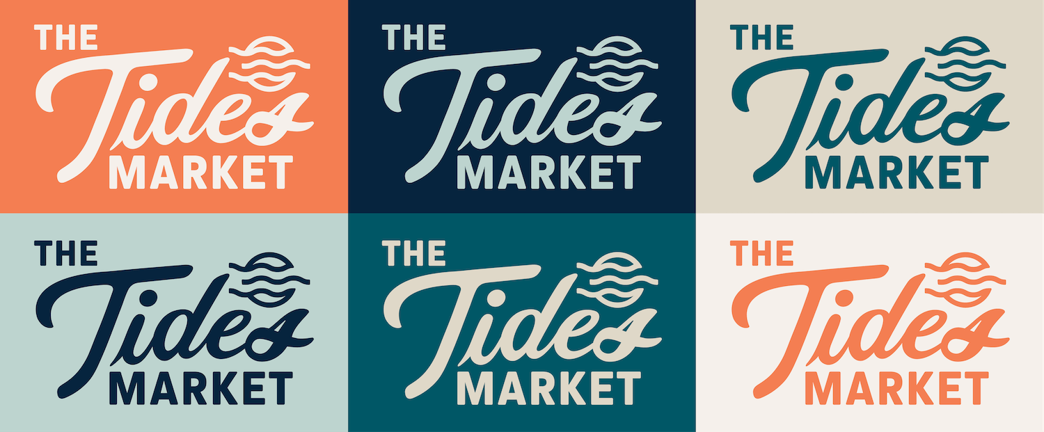
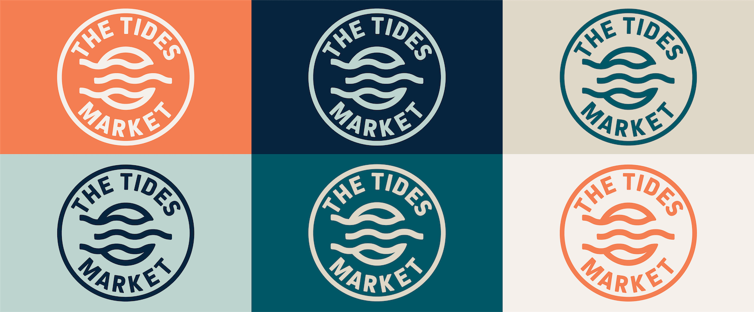
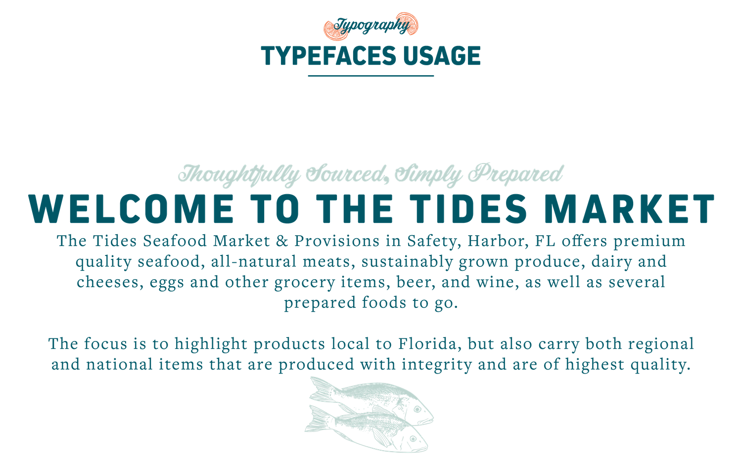
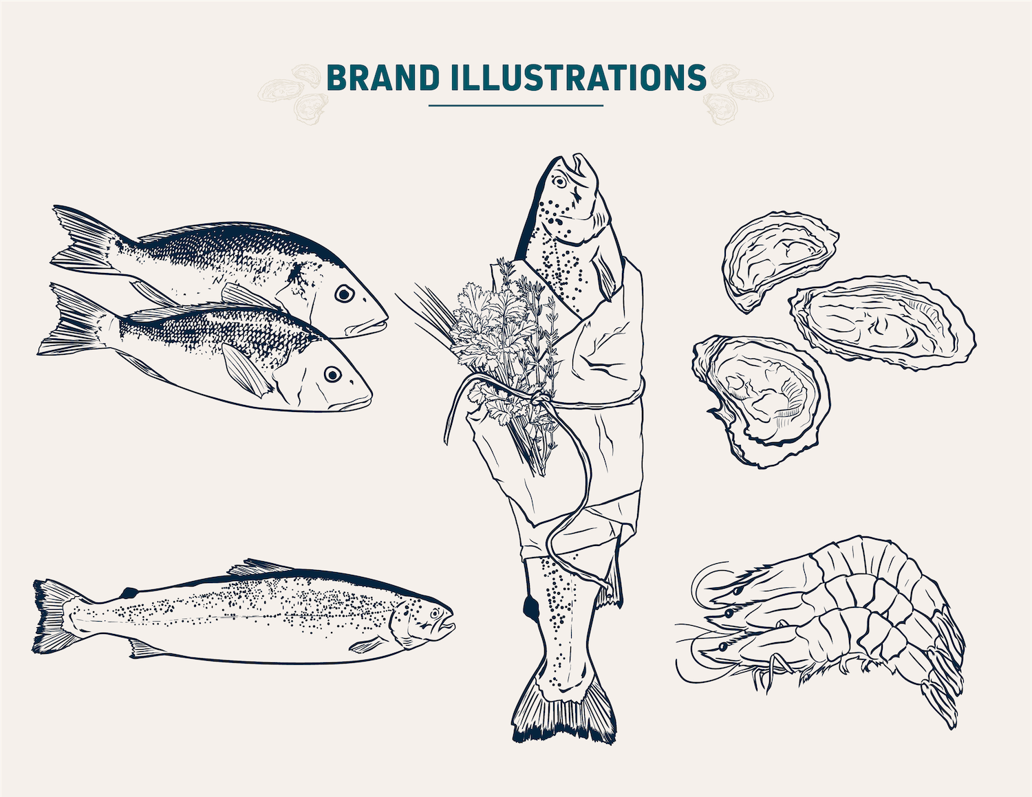
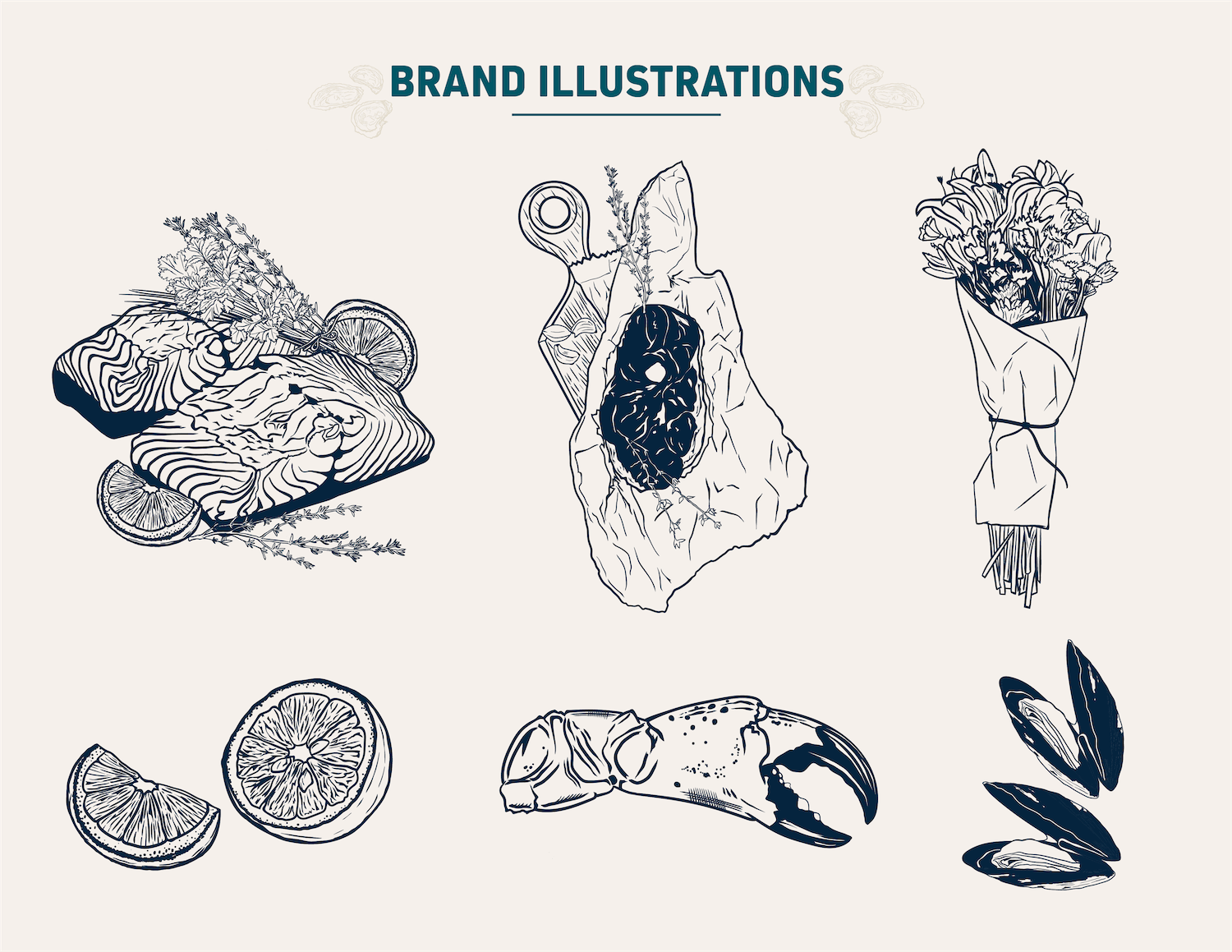
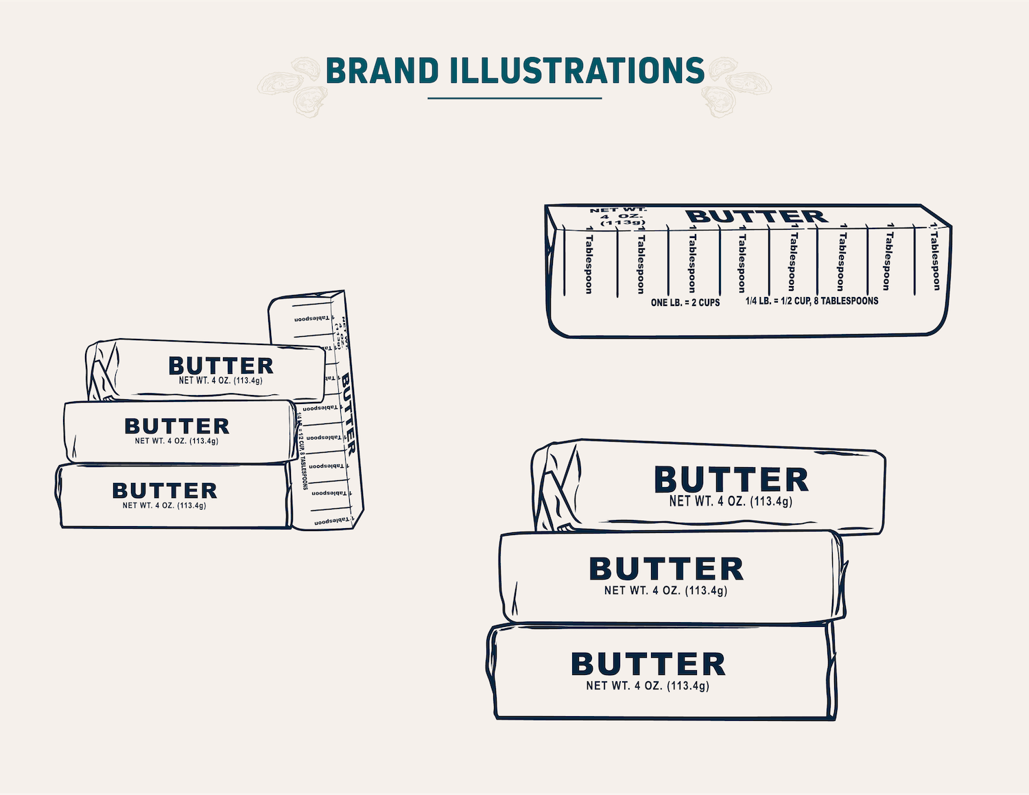
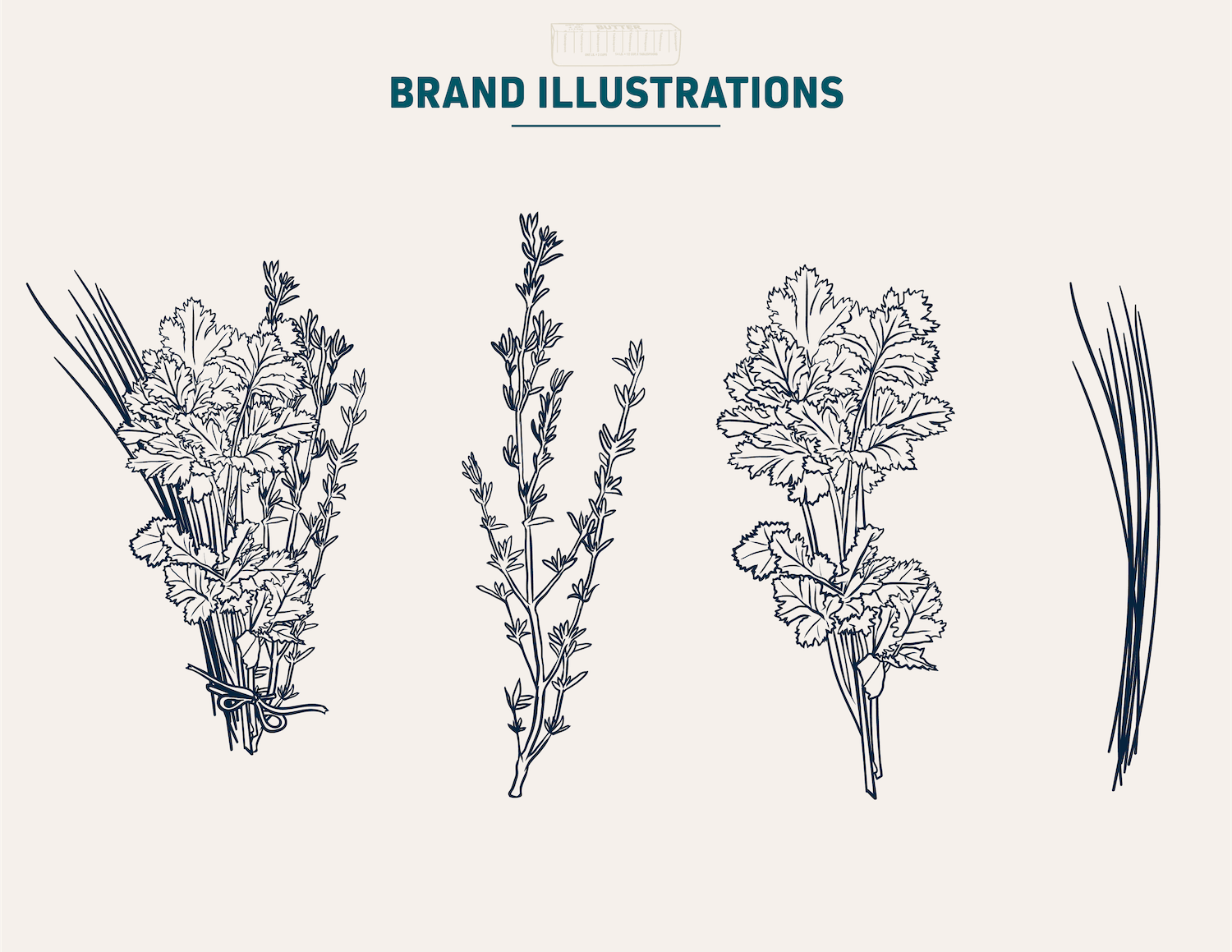
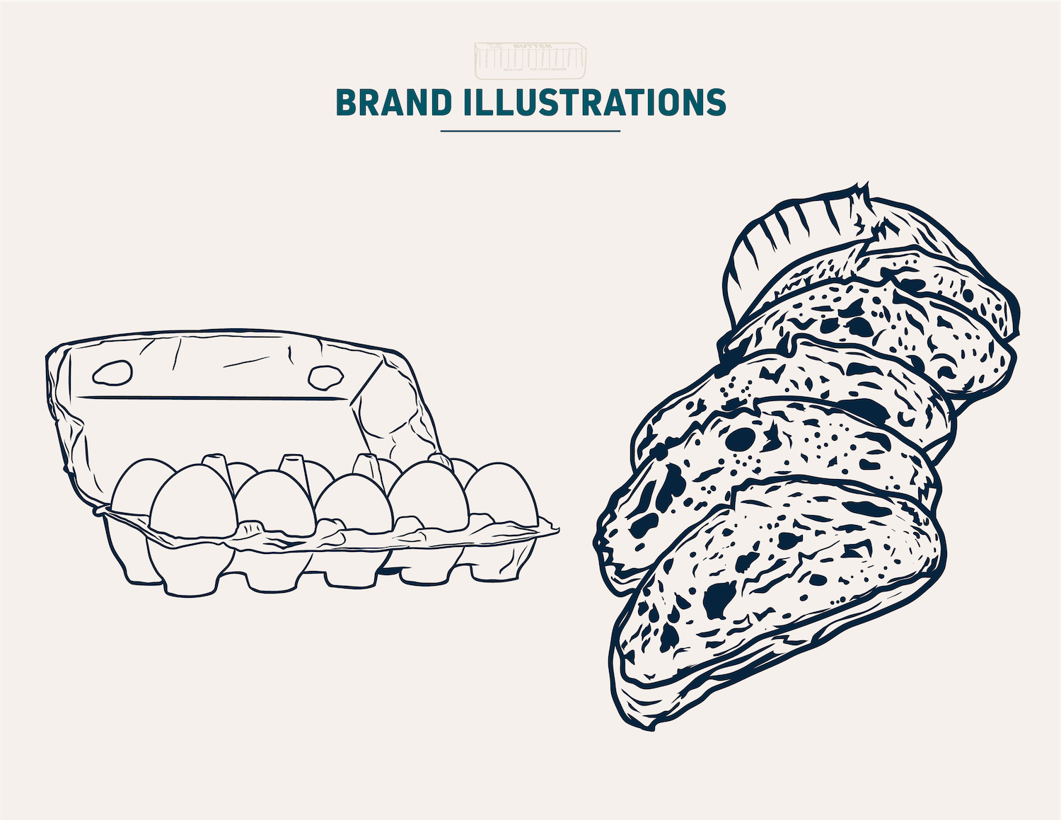

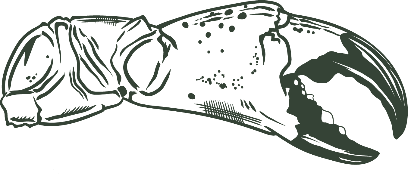
The identity system combines refined typography, a coastal palette and flexible illustrated elements that can shift between elevated dining and approachable retail.
06 · Restaurant Menus
A MENU SYSTEM BUILT FOR CLARITY, FLEXIBILITY AND PRINT CONSISTENCY.
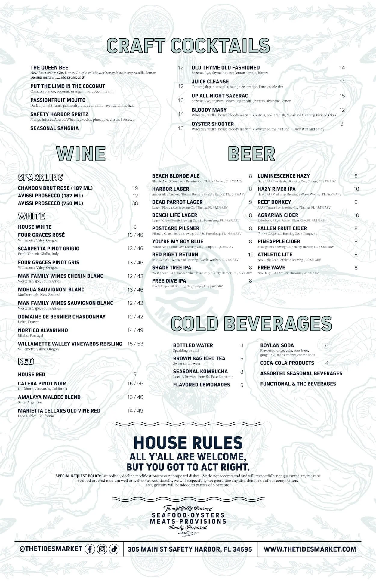
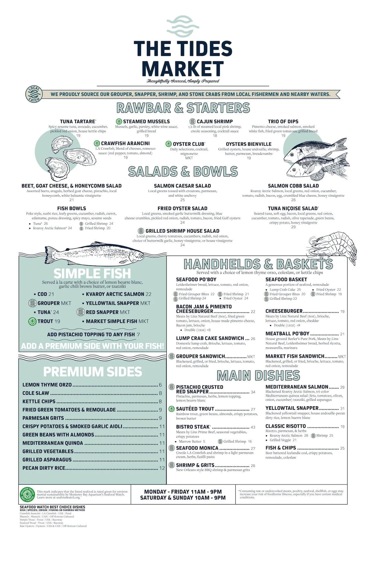
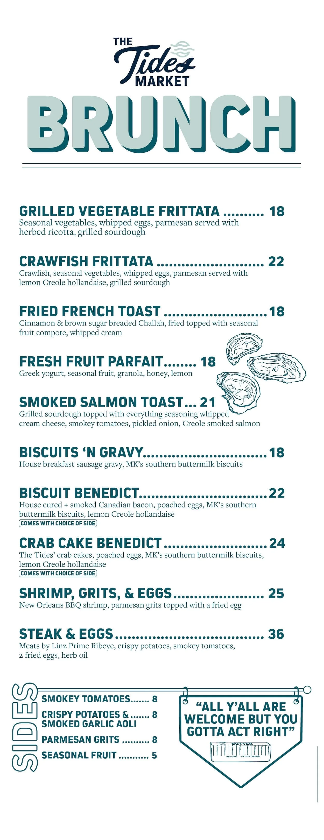
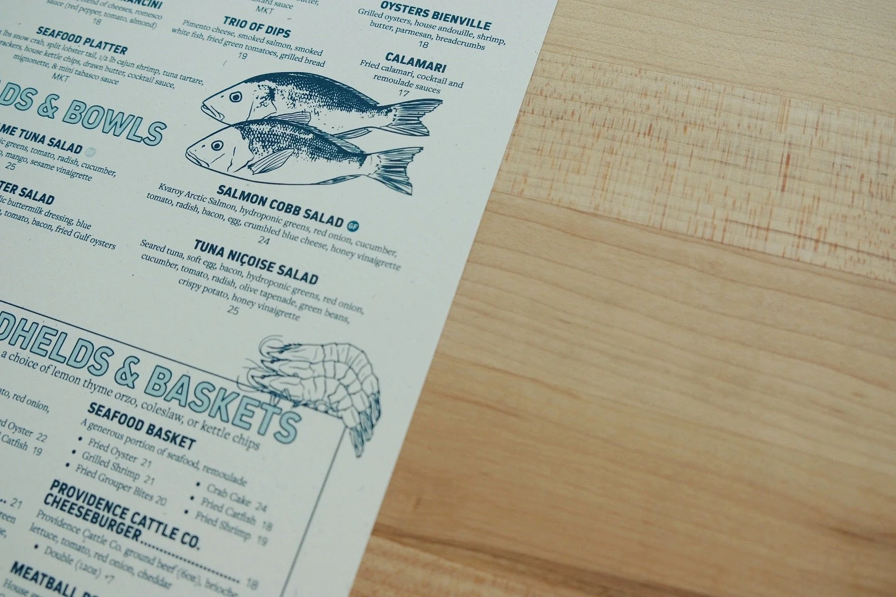
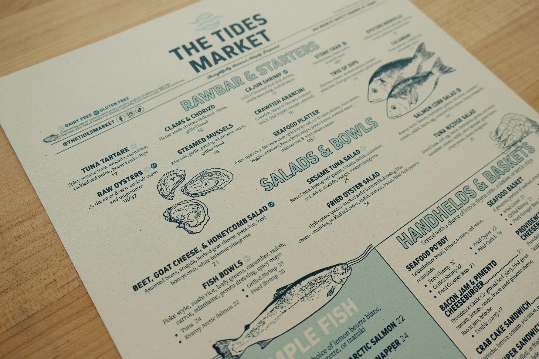
This menu system was designed and structured to support multiple menu categories, ongoing edits and print-ready production.
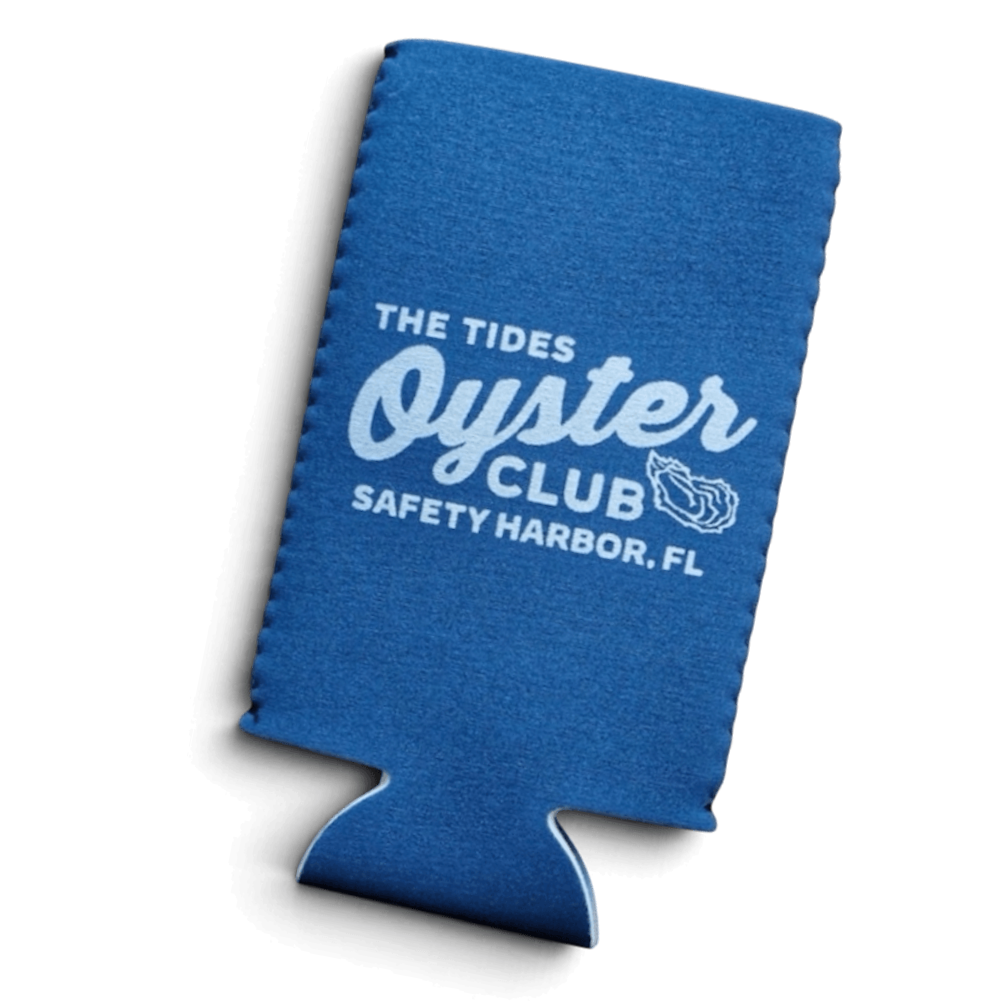
07 · Merchandise
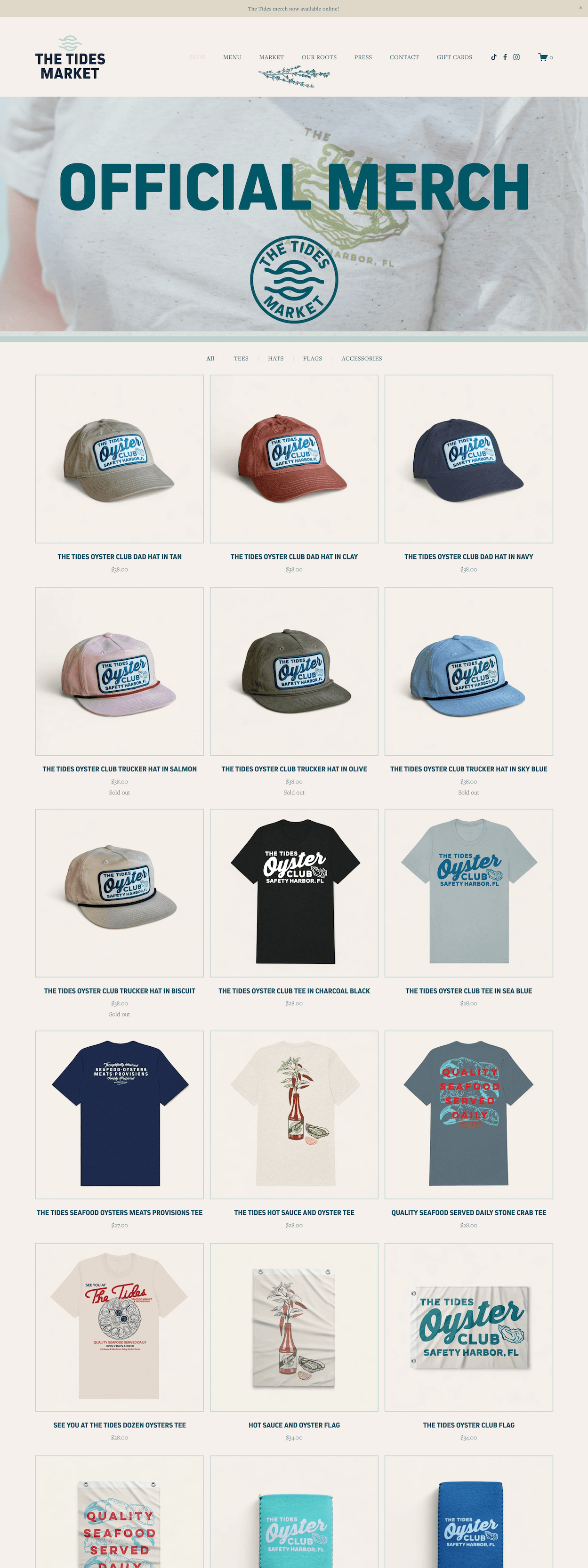
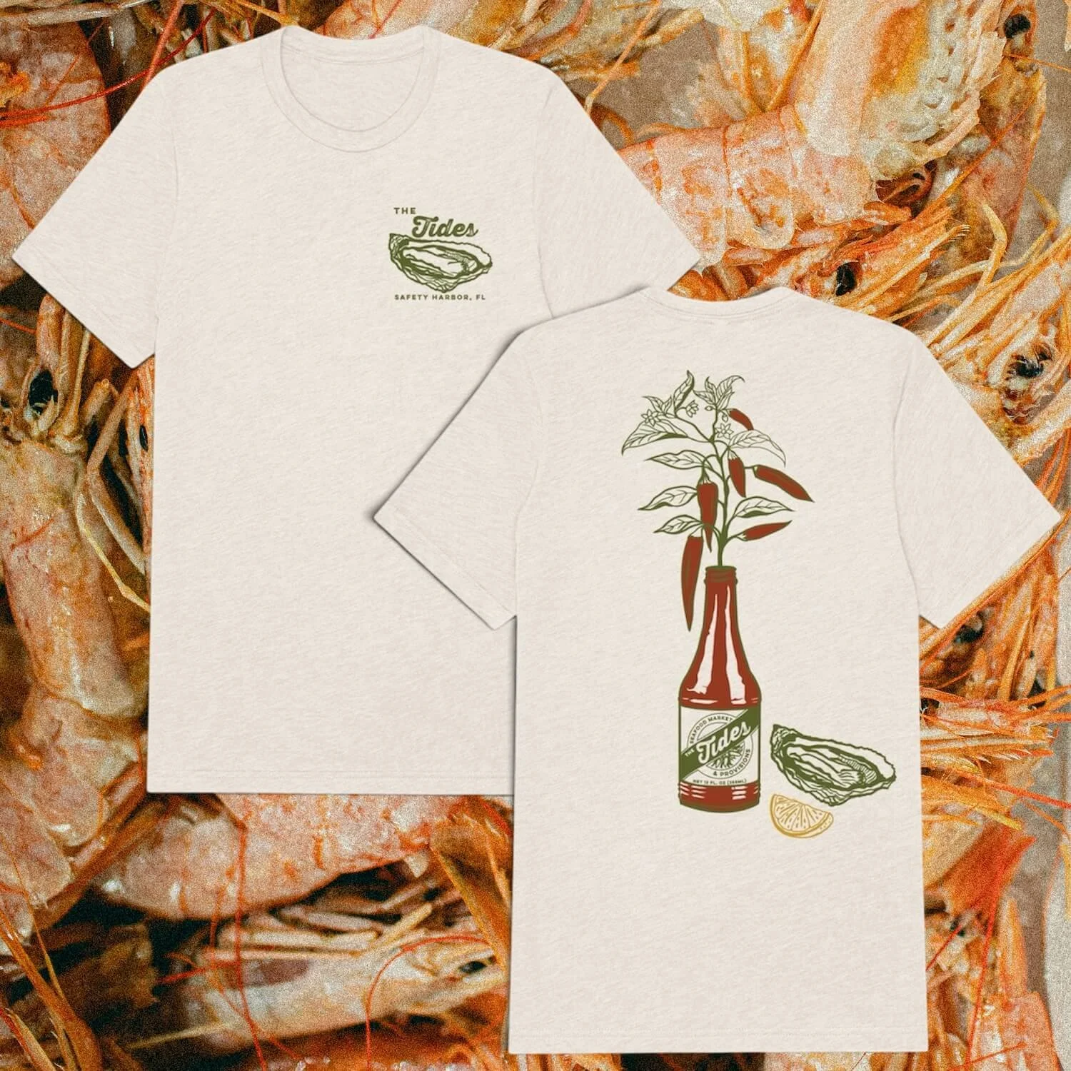
BRINGING THE BRAND INTO PRODUCTS CUSTOMERS COULD WEAR AND COLLECT.
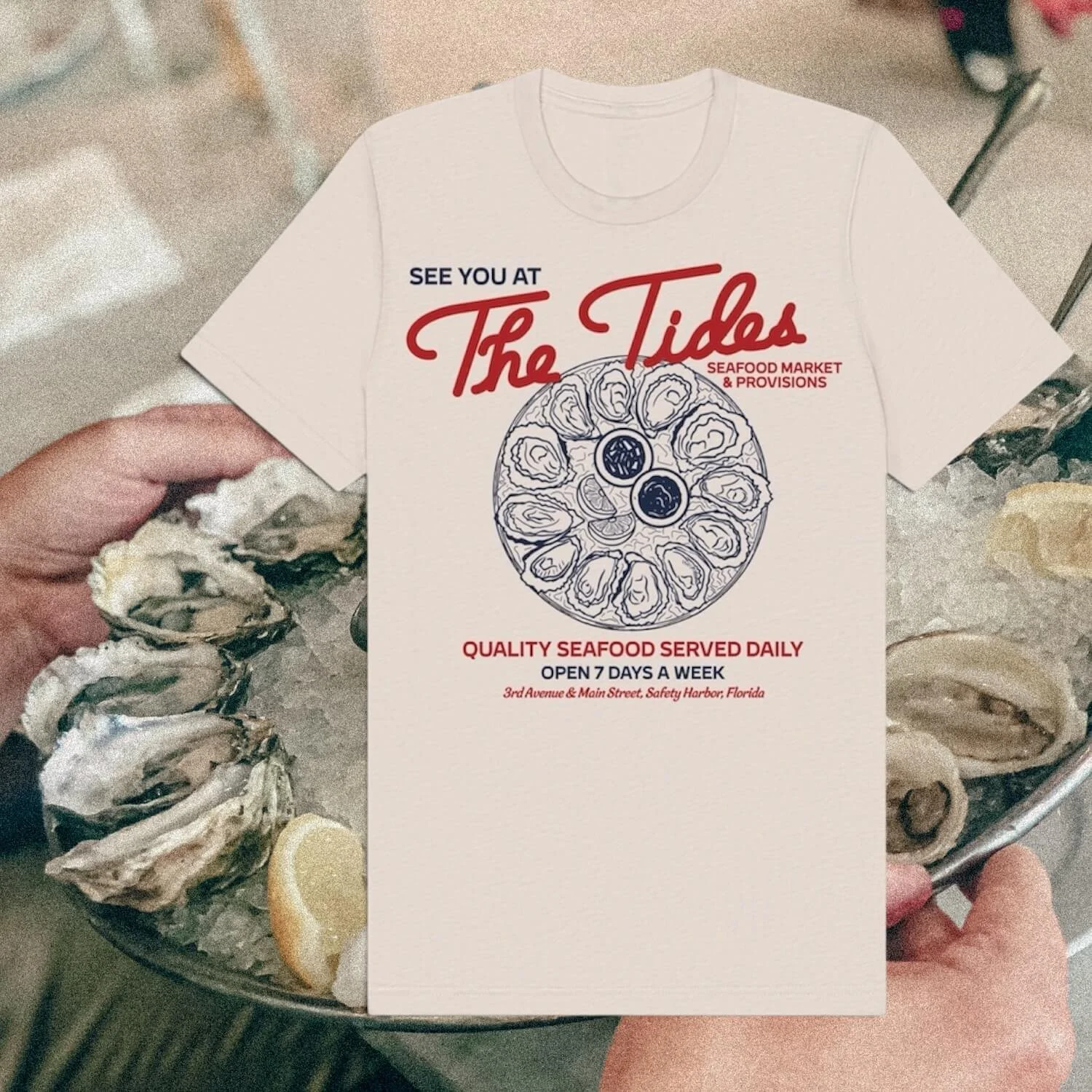
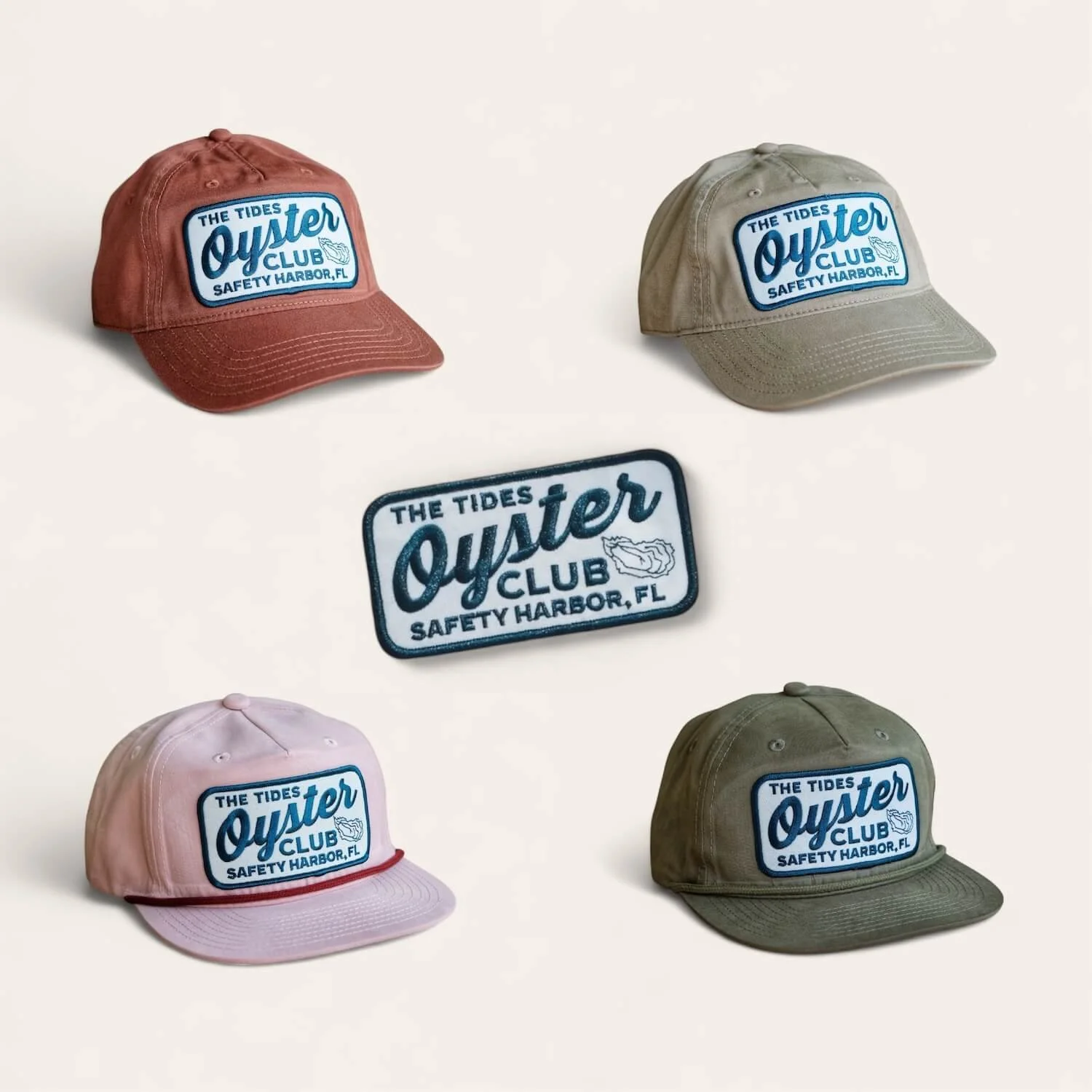
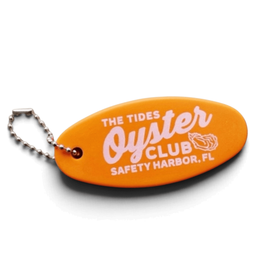
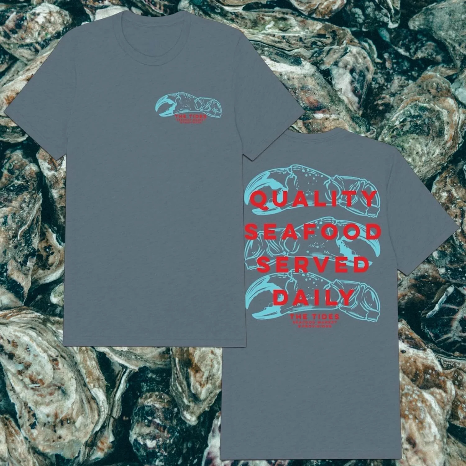
08 · Website
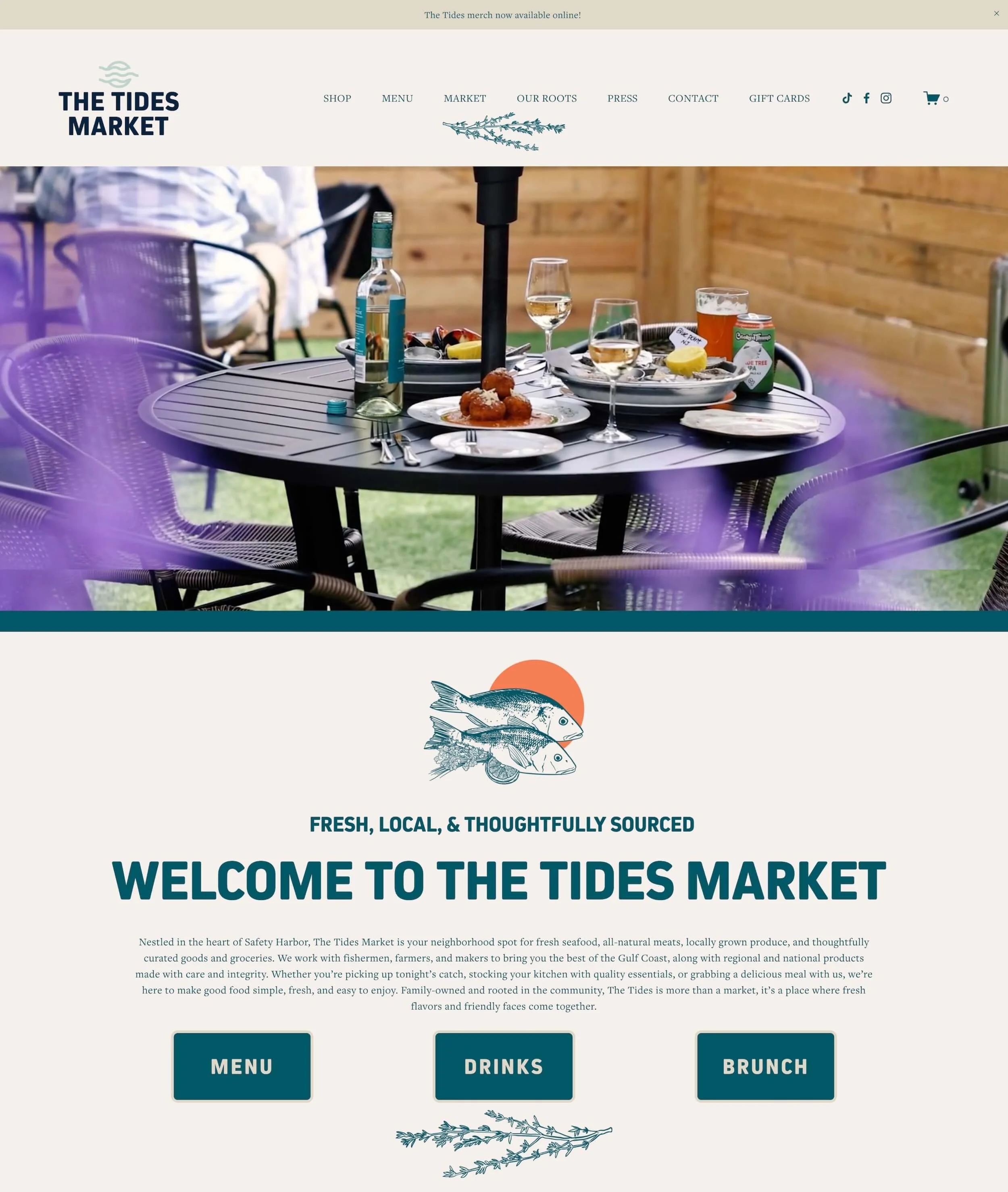
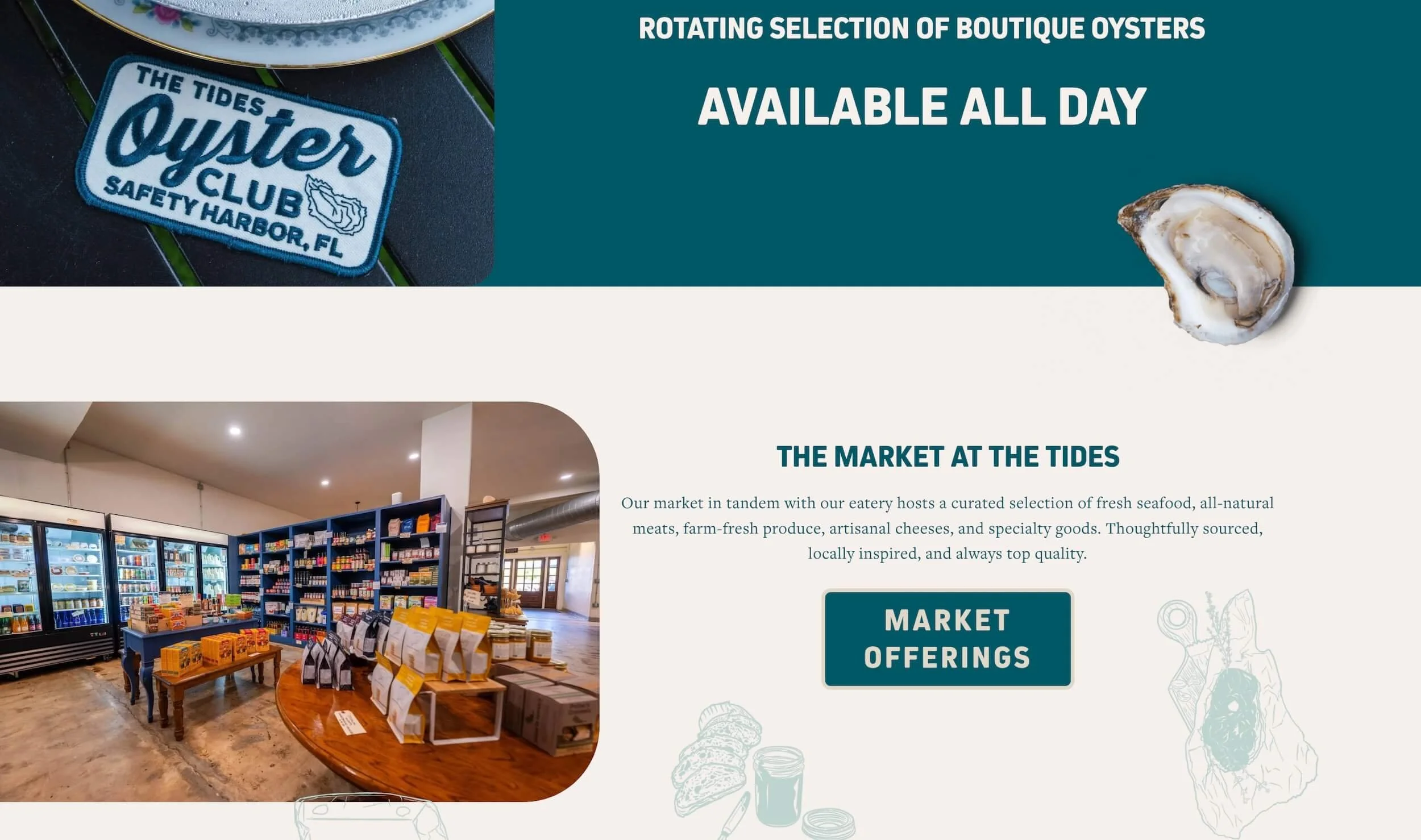
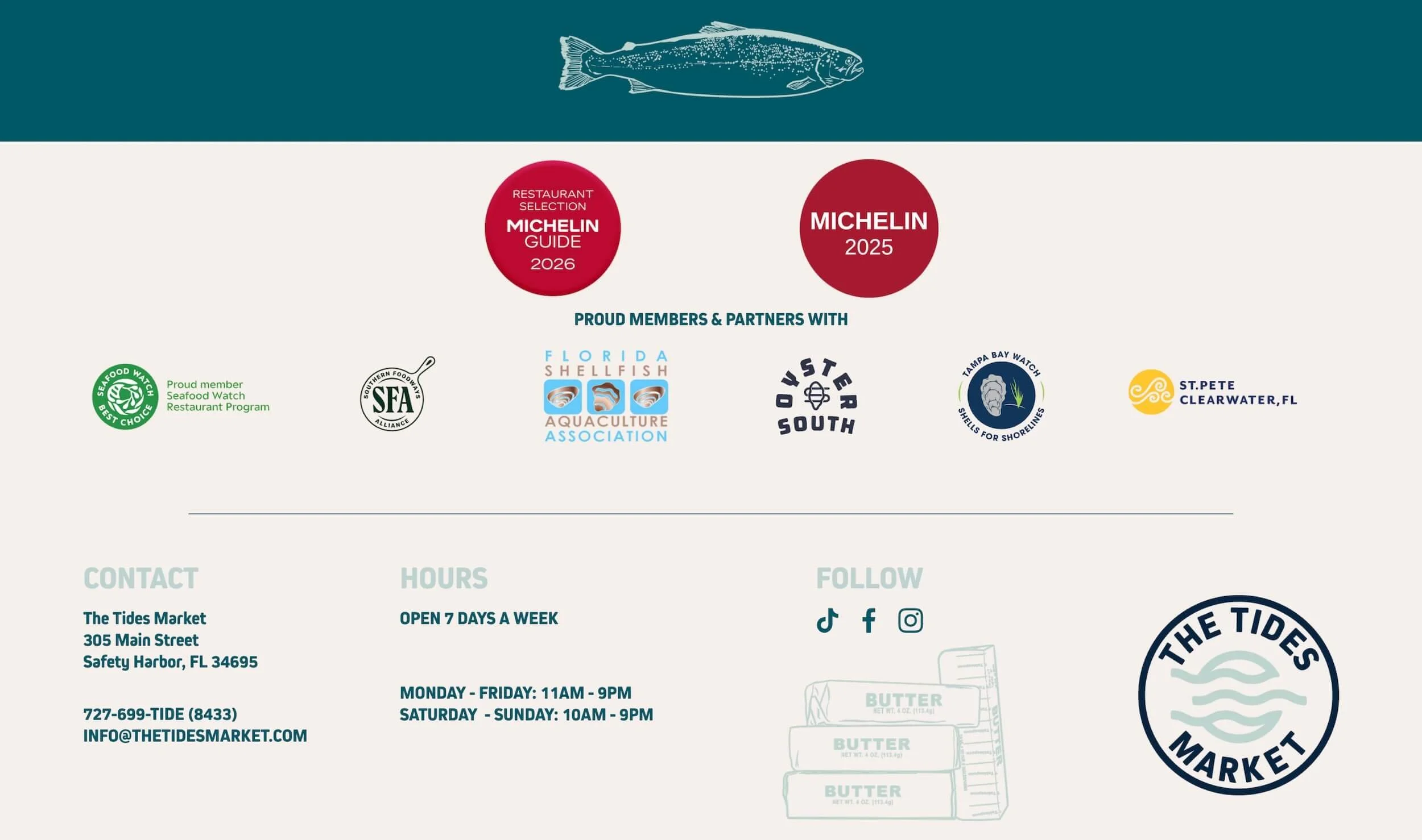
A DIGITAL HOME FOR THE RESTAURANT, MARKET AND GROWING RETAIL PROGRAM.